Color is never just visual; it is biological. The light wavelengths reflected by your bedroom walls interact directly with your retinal ganglion cells, signaling your brain to either produce alertness cortisol or secrete sleep-inducing melatonin.
If you struggle to fall asleep or wake up feeling unrested, high-saturation wall colors—such as energetic yellows, bright primary reds, or stark fluorescent whites—may be keeping your nervous system on high alert.
By choosing paint shades with muted undertones, low light reflectance values (LRV), and velvety dead-matte sheens, you can turn your bedroom into an authentic sleep sanctuary. Here are the most calming bedroom paint colors recommended by sleep science and top interior designers.
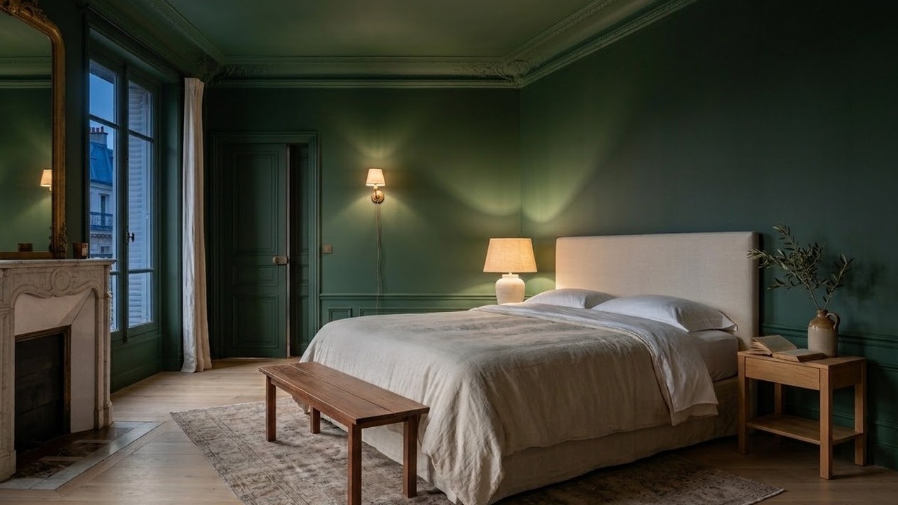
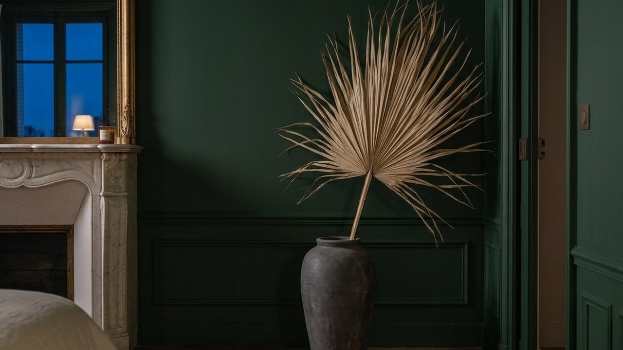
1. Muted Sage & Biophilic Greens
Green sits directly in the center of the visible light spectrum, making it the easiest color for the human eye to process without strain. Evoking natural landscapes and quiet forests, muted greens lower heart rate and reduce salivary cortisol levels.
- Benjamin Moore October Mist (1495): A delicate, silvered sage that acts as a gentle neutral, harmonizing with natural white oak and crisp white linens.
- Sherwin-Williams Evergreen Fog (SW 9130): A chameleon hue with subtle gray and slate undertones that feels deeply grounding in both morning light and evening lamplight.
- Farrow & Ball French Gray (No. 18): More green than gray, this heritage shade softens harsh window shadows and provides a historic, peaceful ambiance.
2. Atmospheric Slate Blues
In sleep studies, participants sleeping in soft blue bedrooms consistently report the longest sleep duration and highest sleep quality scores. Blue activates parasympathetic nervous responses, encouraging deeper diaphragmatic breathing.
- Benjamin Moore Boothbay Gray (HC-165): A sophisticated blue-gray with enough pigment depth to prevent it from feeling chilly.
- Sherwin-Williams Mineral Deposit (SW 7652): A misty coastal blue that evokes tranquil morning ocean fog.
- Farrow & Ball De Nimes (No. 299): A quiet, grounded denim blue that adds cozy intimacy to master bedrooms without feeling dark.
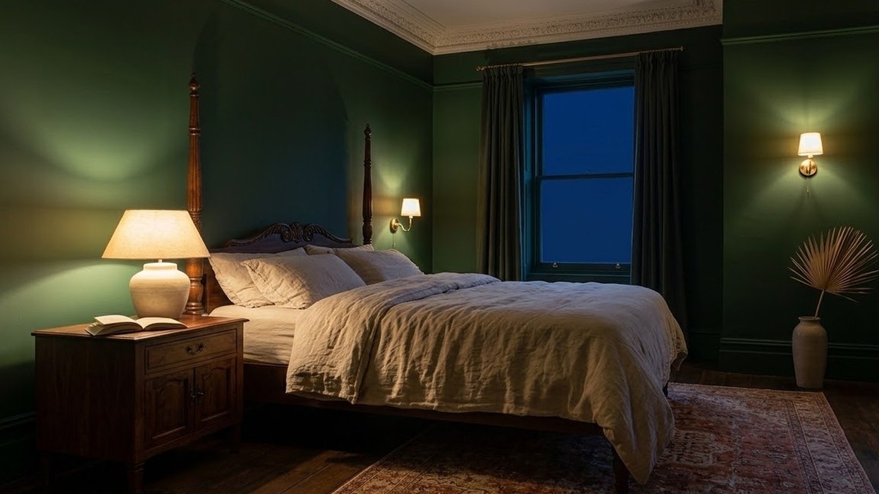
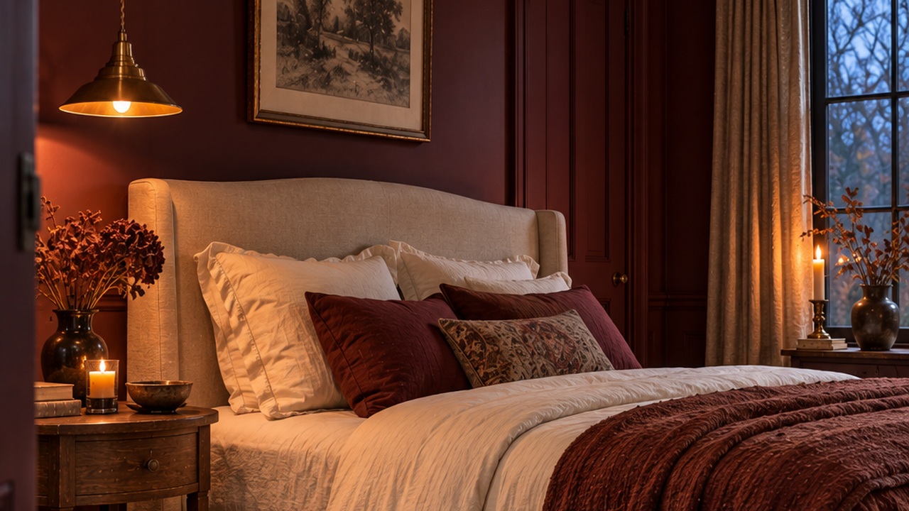
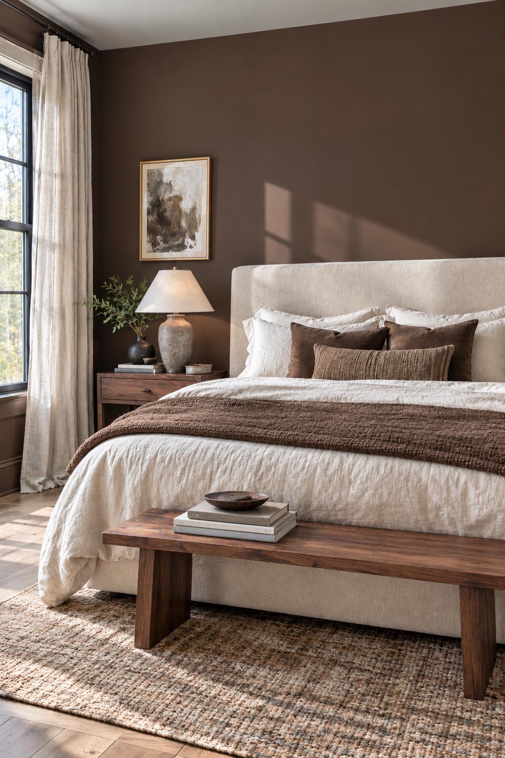
3. Warm Earth Tones & Cocooning Greiges
If you prefer warm neutrals over cool tones, avoid stark cool grays or sterile hospital whites. Instead, choose chalky, mineral-based stone shades:
- Benjamin Moore Swiss Coffee (OC-45): A creamy, welcoming off-white that creates a warm, restful glow when paired with 2700K bedside reading lamps.
- Sherwin-Williams Natural Choice (SW 7011): A balanced neutral with subtle umber undertones that avoids yellow or pink casts.
- Farrow & Ball Elephant's Breath (No. 229): An uplifting contemporary greige that turns delightfully soft and moody in the evening.
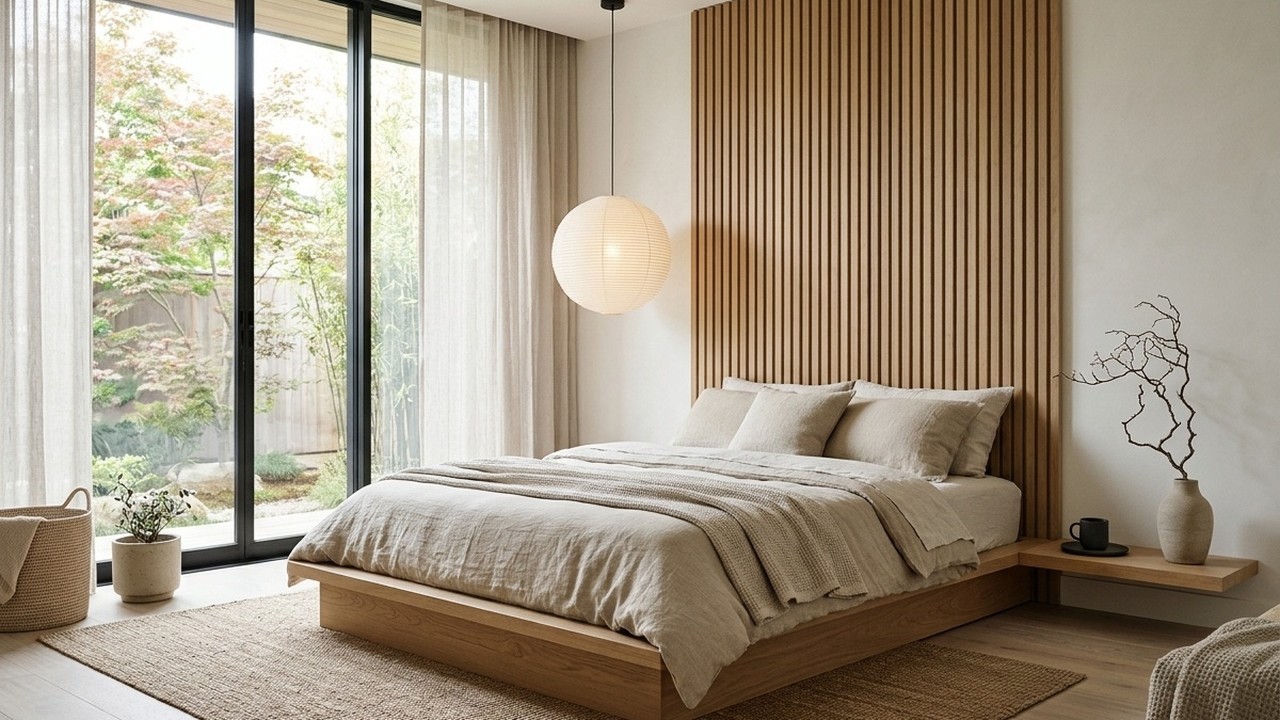
4. The Critical Role of Paint Sheen
The finish you choose is just as important as the pigment. High-sheen paints—like satin, semi-gloss, or gloss—bounce light around the room, highlighting surface imperfections and creating visual stimulation.
- Dead Matte or Flat: Absorbs reflections and gives walls a luxurious, velvety depth that lowers visual noise.
- Low-Luster Eggshell: Ideal for households that need scrubbable walls while maintaining a soft, non-reflective appearance.
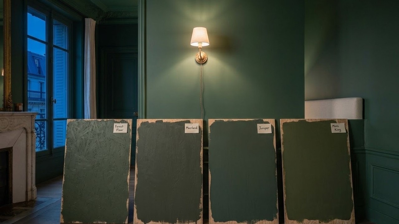
5. Paint Swatch Testing Protocol
Never pick a bedroom wall color under the harsh fluorescent lighting of a hardware store. Paint a 24x24-inch sample board and observe it under three conditions:
- 8:00 AM Morning Light: Look for harsh undertones in cool morning daylight.
- 2:00 PM Afternoon Light: Verify the color does not wash out in direct sun.
- 9:00 PM Lamplight: Ensure the color remains cozy and restful under your 2700K bedside bulbs.
Frequently Asked Questions
What color is proven to help you sleep best?
Muted blue-grays and soft sage greens consistently rank highest in sleep studies. These colors mimic natural twilight and forested environments, which trigger the body's natural relaxation pathways.
Should bedroom ceilings be painted white or the wall color?
Painting the ceiling 1 to 2 shades lighter than the walls, or painting the ceiling the exact same color as the walls (color drenching), eliminates the harsh contrast line between wall and ceiling, creating an expansive, cocooning atmosphere.
What colors should you avoid in a bedroom?
Avoid saturated bright reds, vibrant neon oranges, high-contrast purples, and high-gloss stark white. These colors stimulate the nervous system and increase heart rate.
What is LRV and why does it matter for sleep?
Light Reflectance Value (LRV) measures the percentage of light a paint color reflects on a scale of 0 (absolute black) to 100 (pure white). For a restful bedroom, choose paint colors with an LRV between 25 and 55 to prevent harsh glare.